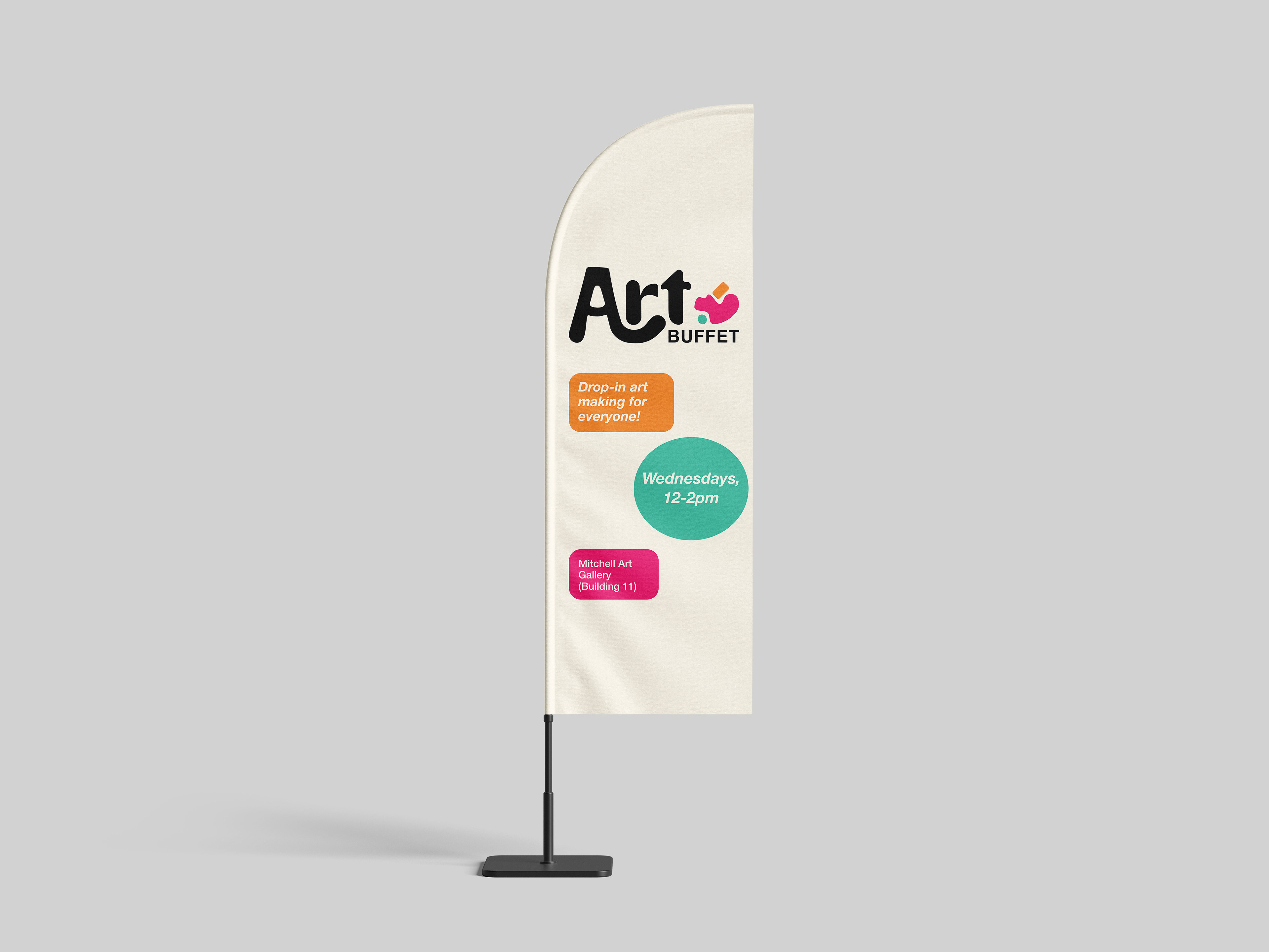
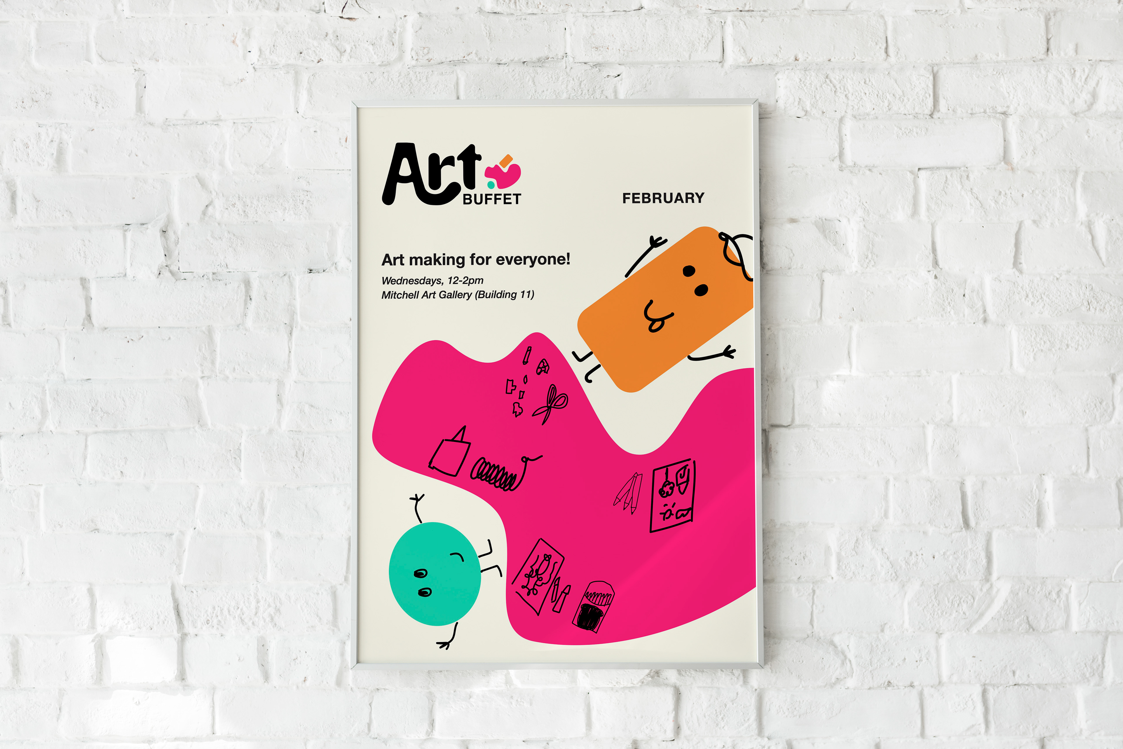
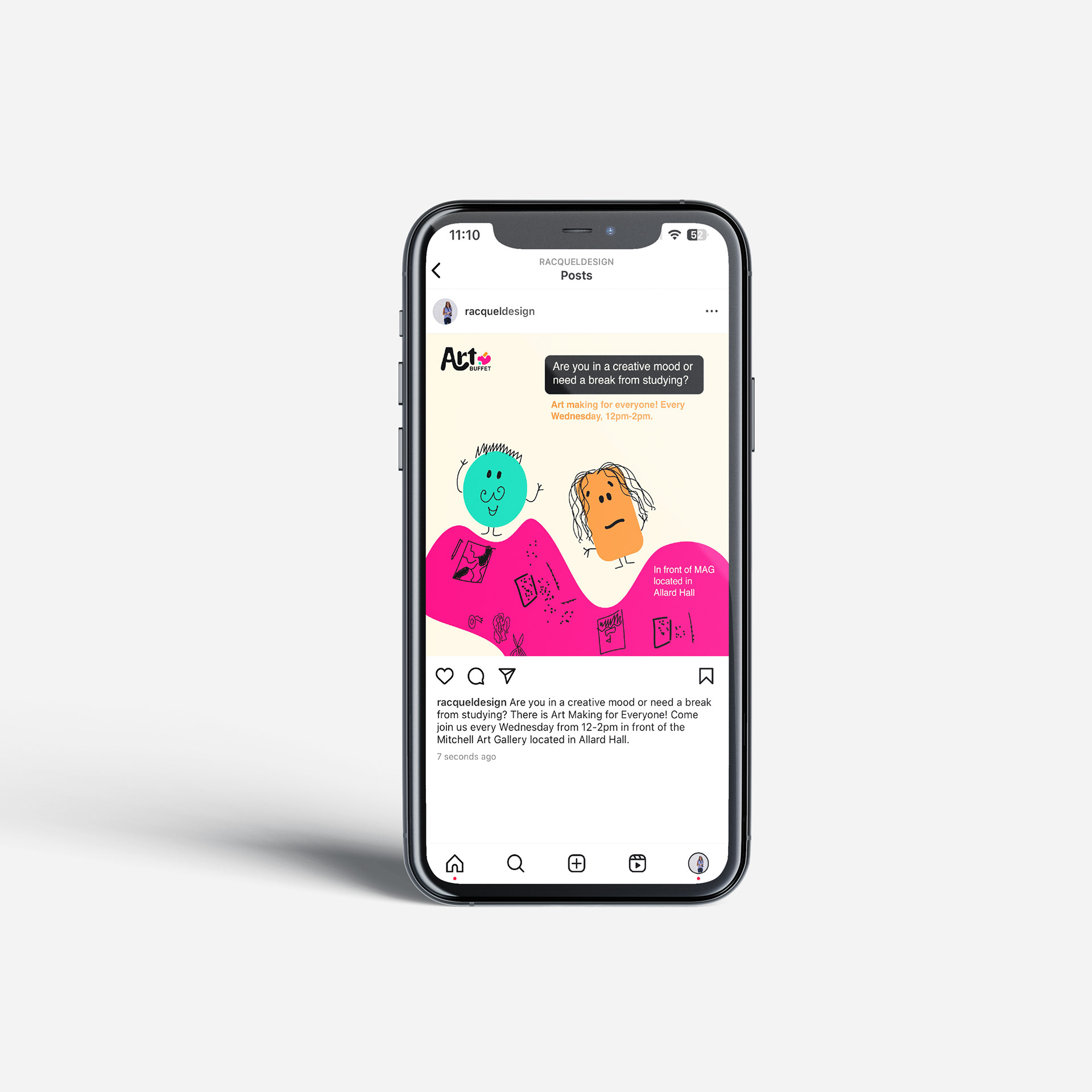
art buffet redesign
This logo represents the regular event, the Art Buffet run by the MacEwan Art Gallery, MAG. The Art Buffet is a welcoming low-pressure, creative event for any participants interested in meeting new people and doing art. This event often has a welcoming and fun atmosphere.
The circle and squares are an illustration of the individuals attending the event. Experiences in life come in all shapes and sizes. The bigger shape of the three alludes to the table that is shared amongst the participants but also the variety of activities that are mixed amongst the table.

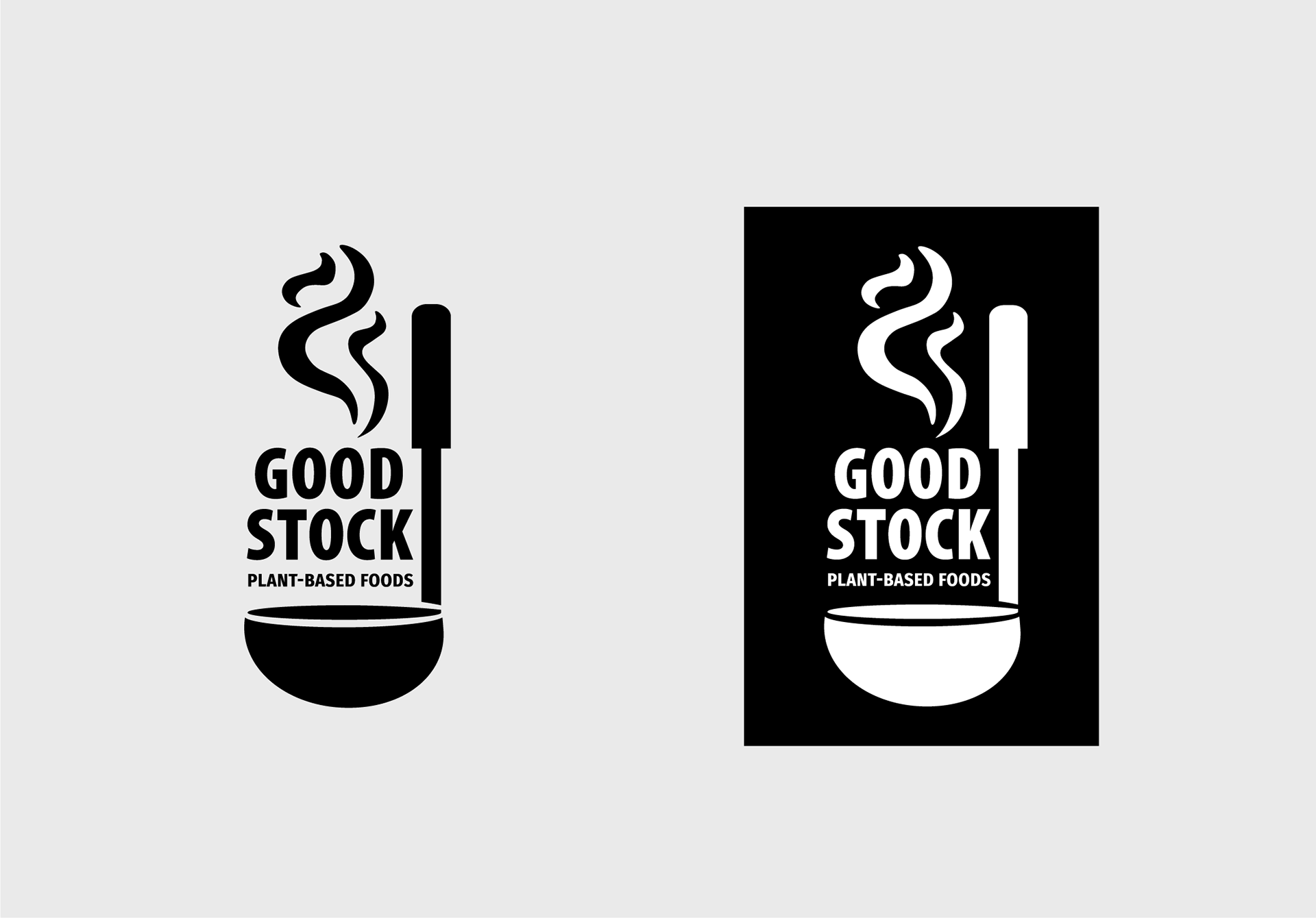
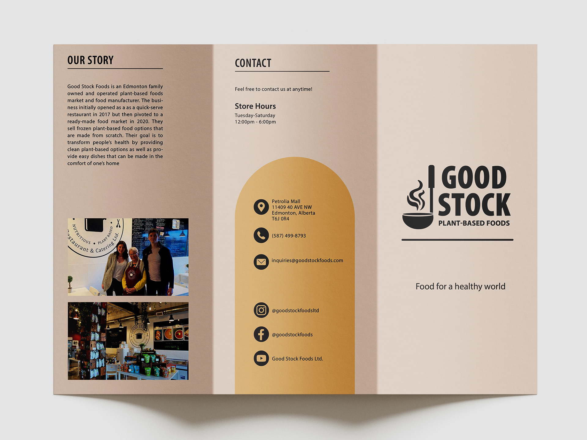
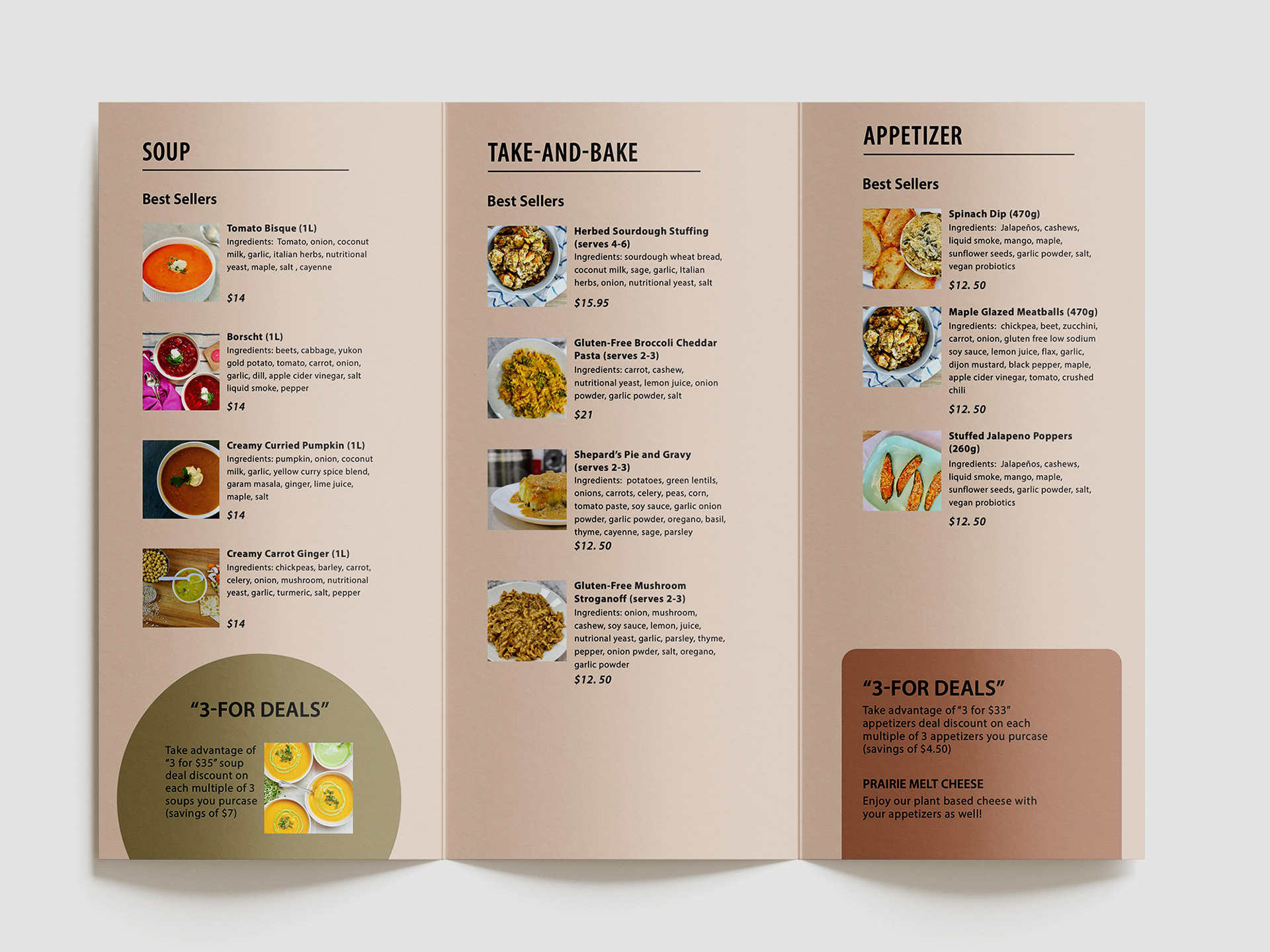
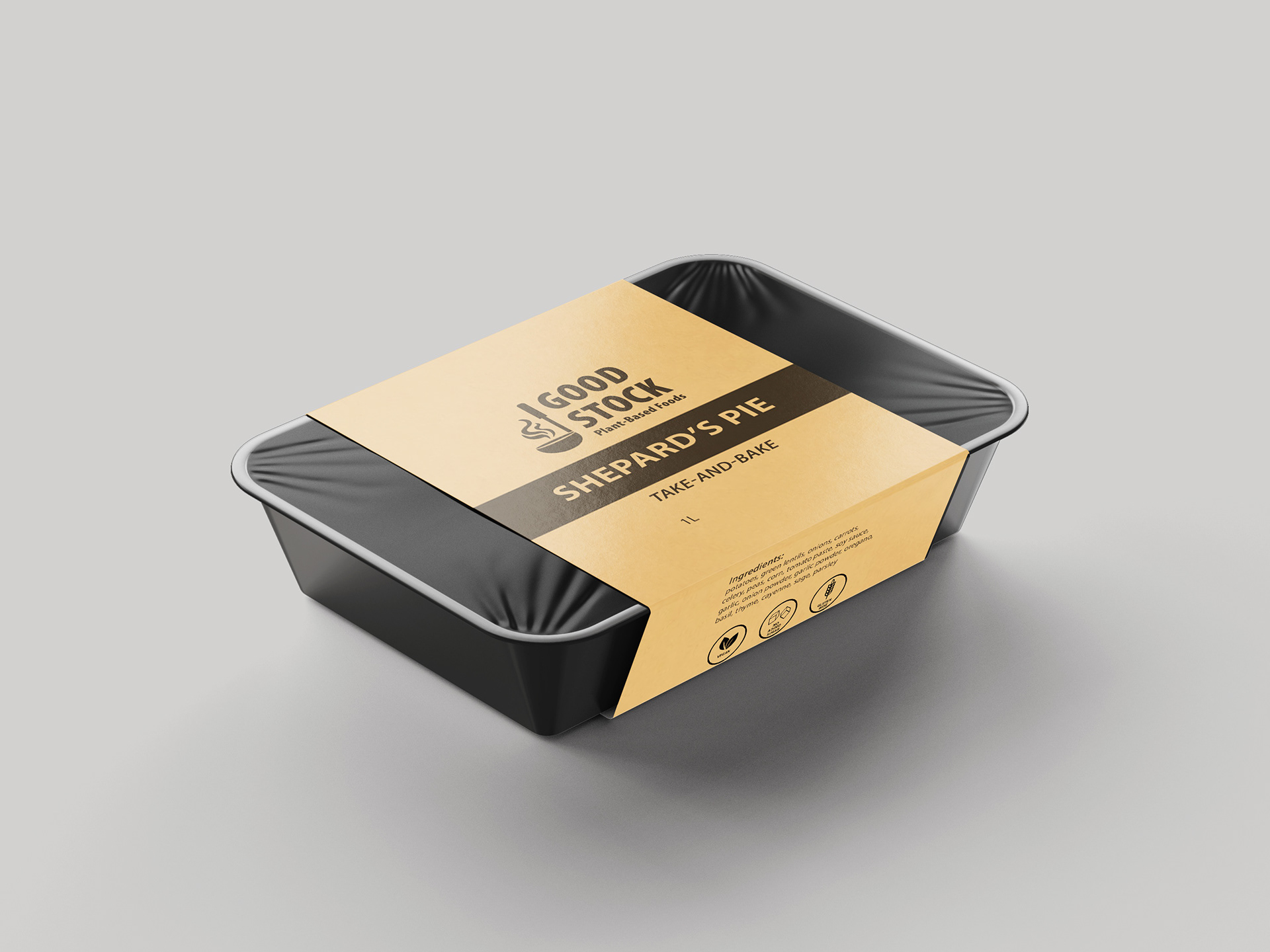
good stock brand redesign
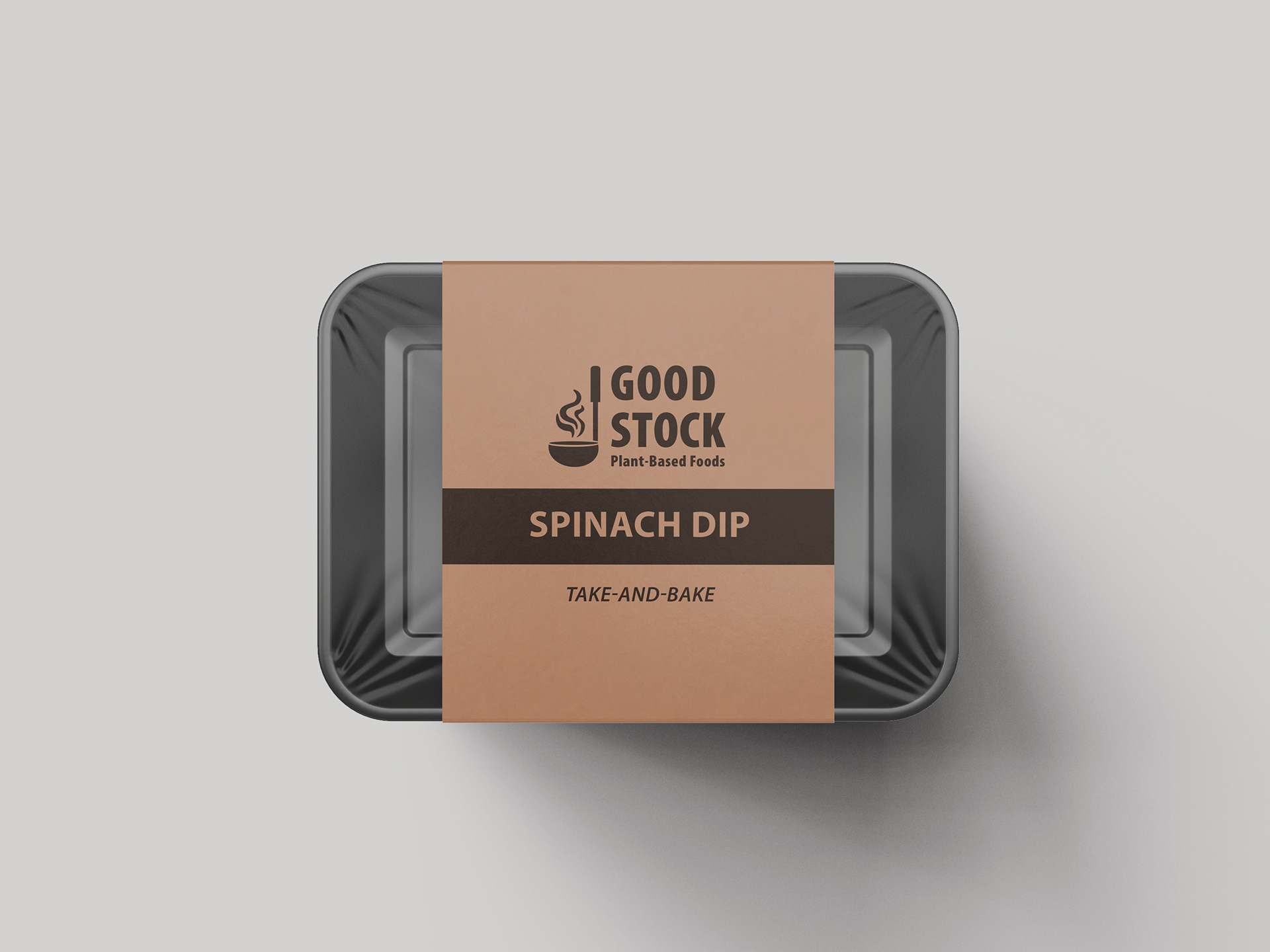
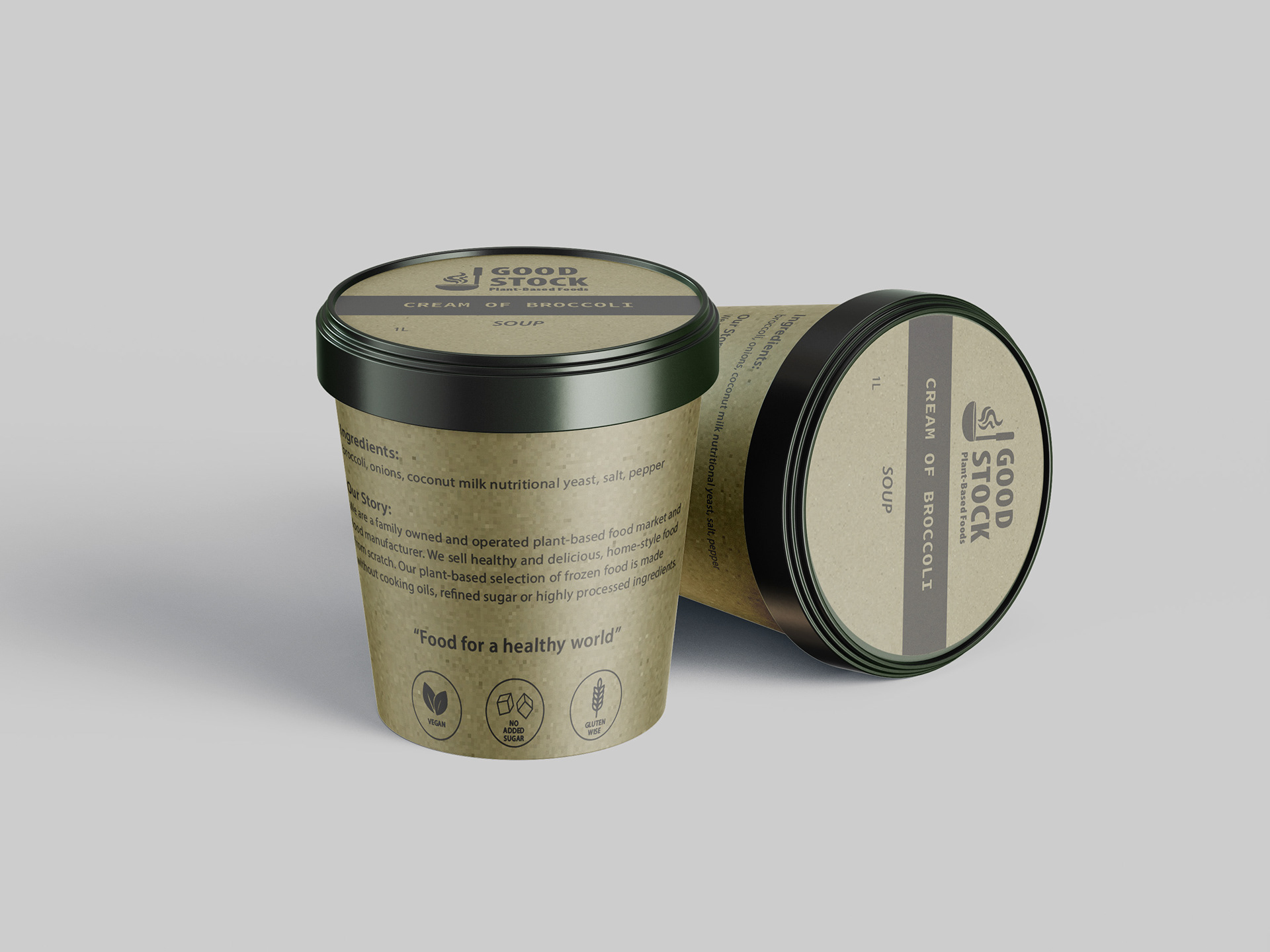
This project is a full package redesign of an Edmonton local business, Good Stock Foods. This redesign was for a university branding project and is not the current branding for the business. This brand identity focuses on the welcoming, inviting and homey feeling of the market business.
The earth tone colors chosen are saje green, yellow and red. These colors relate back to the earth relation of vegan and plant-based foods. Customers are drawn to the business because of the real food they make and the healthy aspect of their products. Throughout some of the collateral, a beige color is brought in as a base for the three earth tone colors to settle on.